Martin's Handmade Pretzels - Identity, branding and packaging
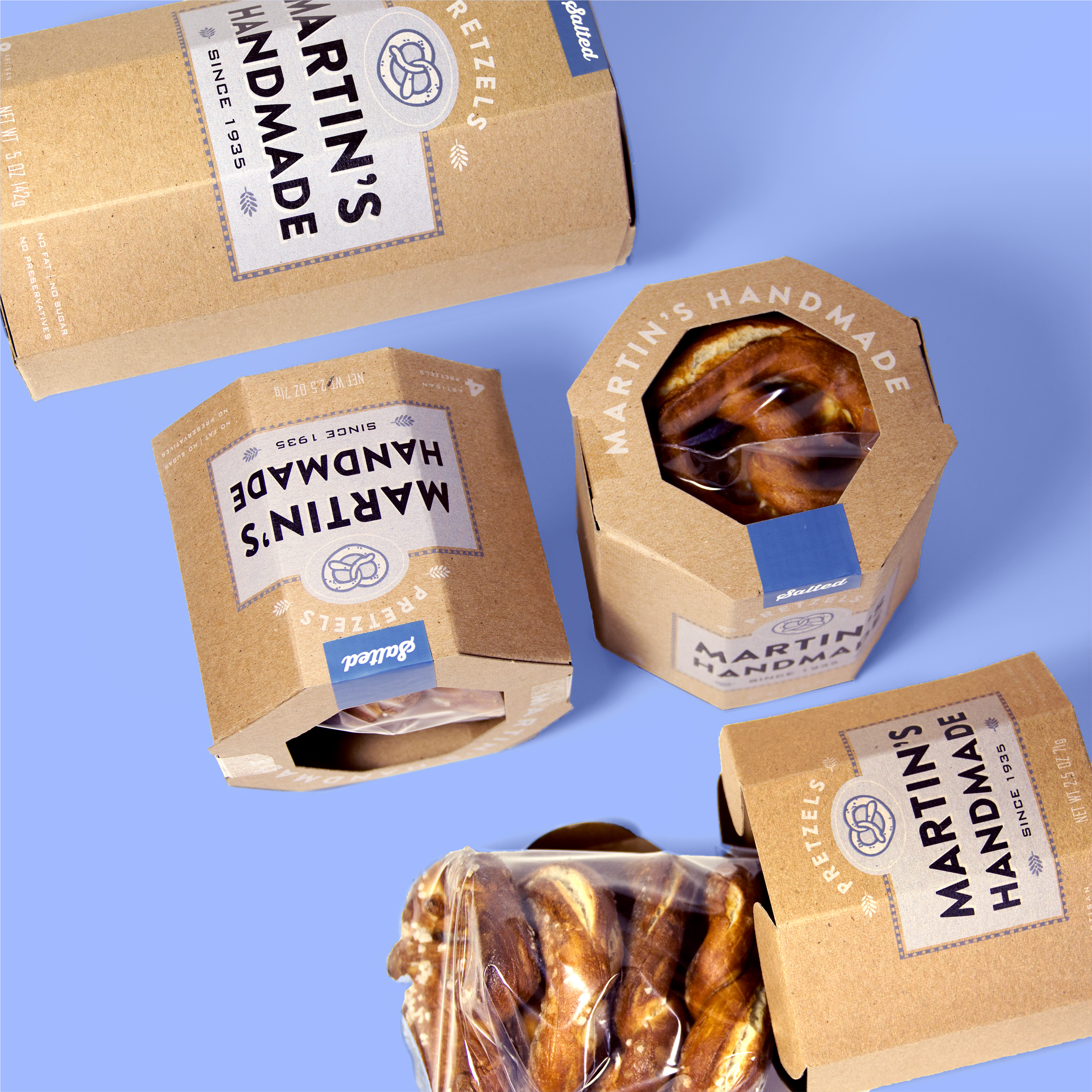
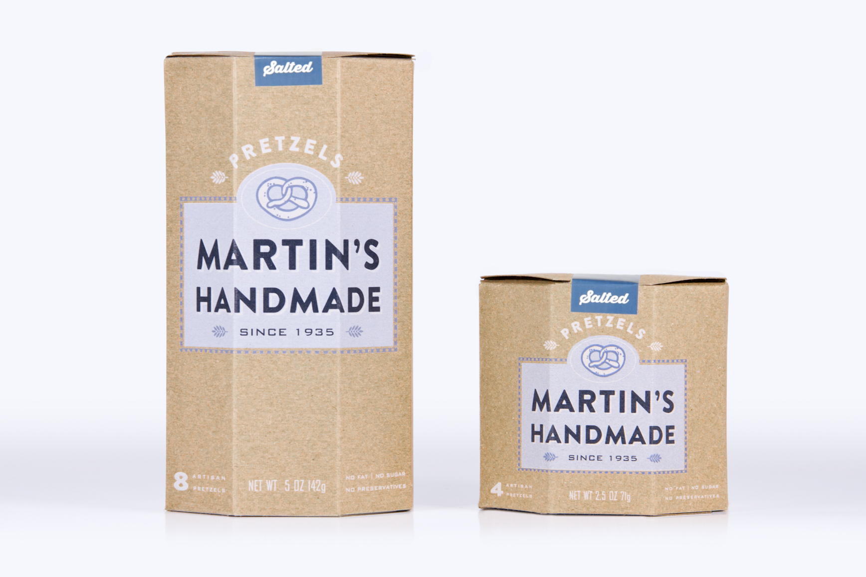
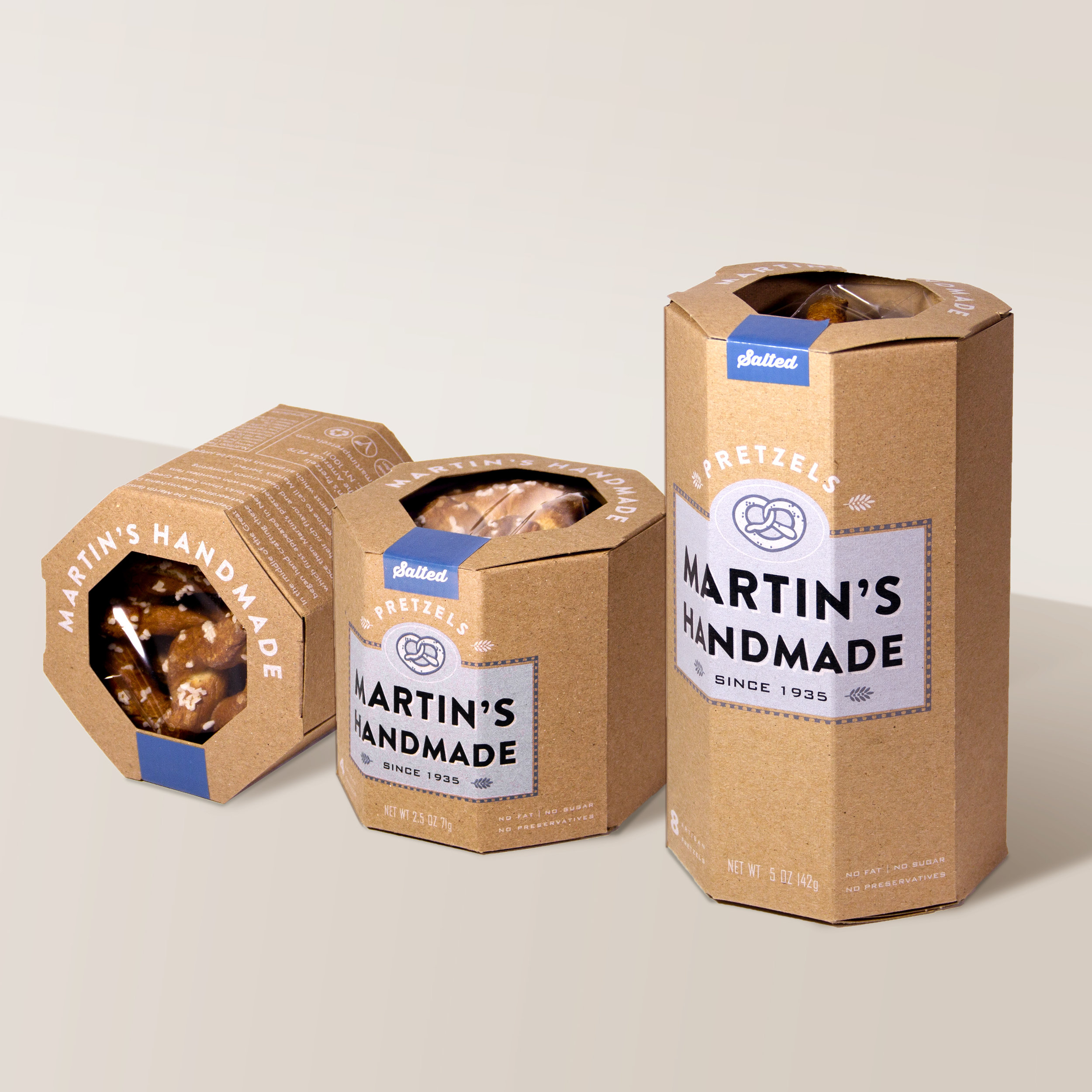
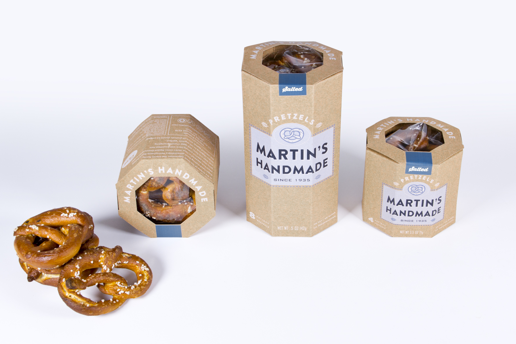
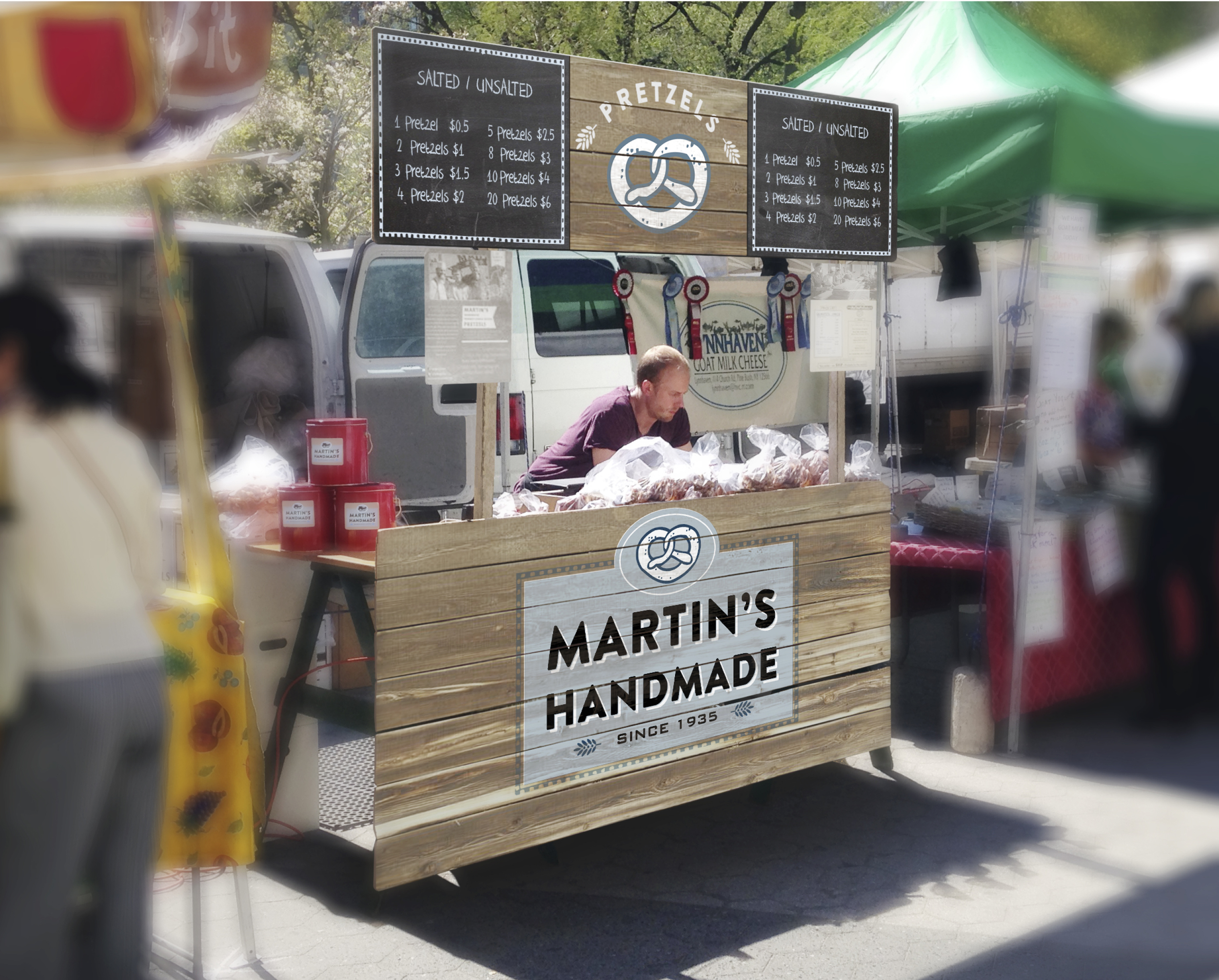
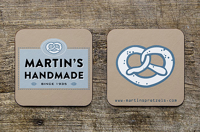
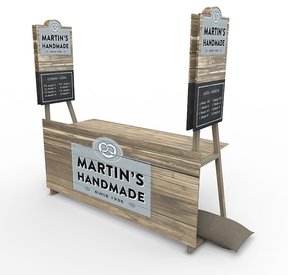
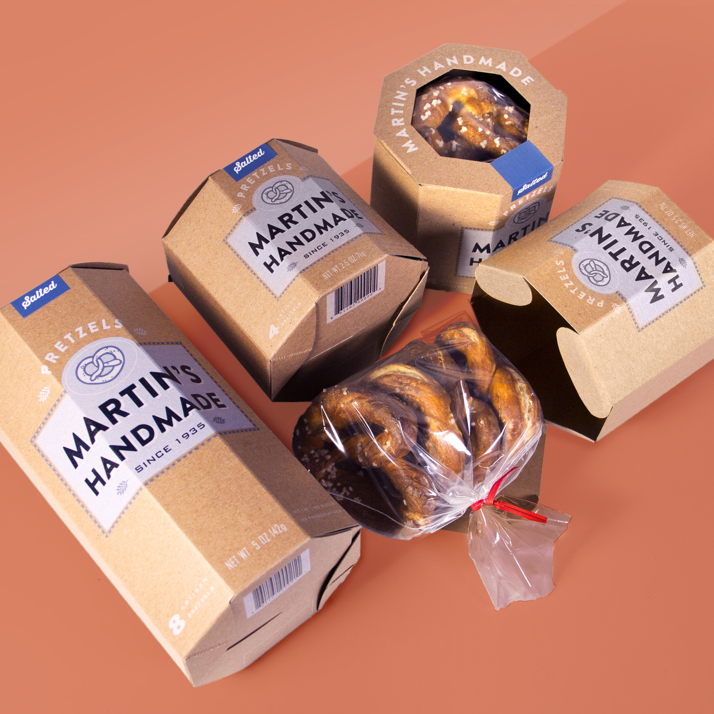
Martin's have been selling their artisan pretzels in the green markets of New York City for over 30 years, and knew it was time to make the move into retail. Swerve were asked to help with the creation of unique packaging and to evolve the presentation of the brand. Working closely with the Martin's team we evolved the identity and designed a line of packaging and promotional pieces that build upon their individual character and their deliciously famous products.
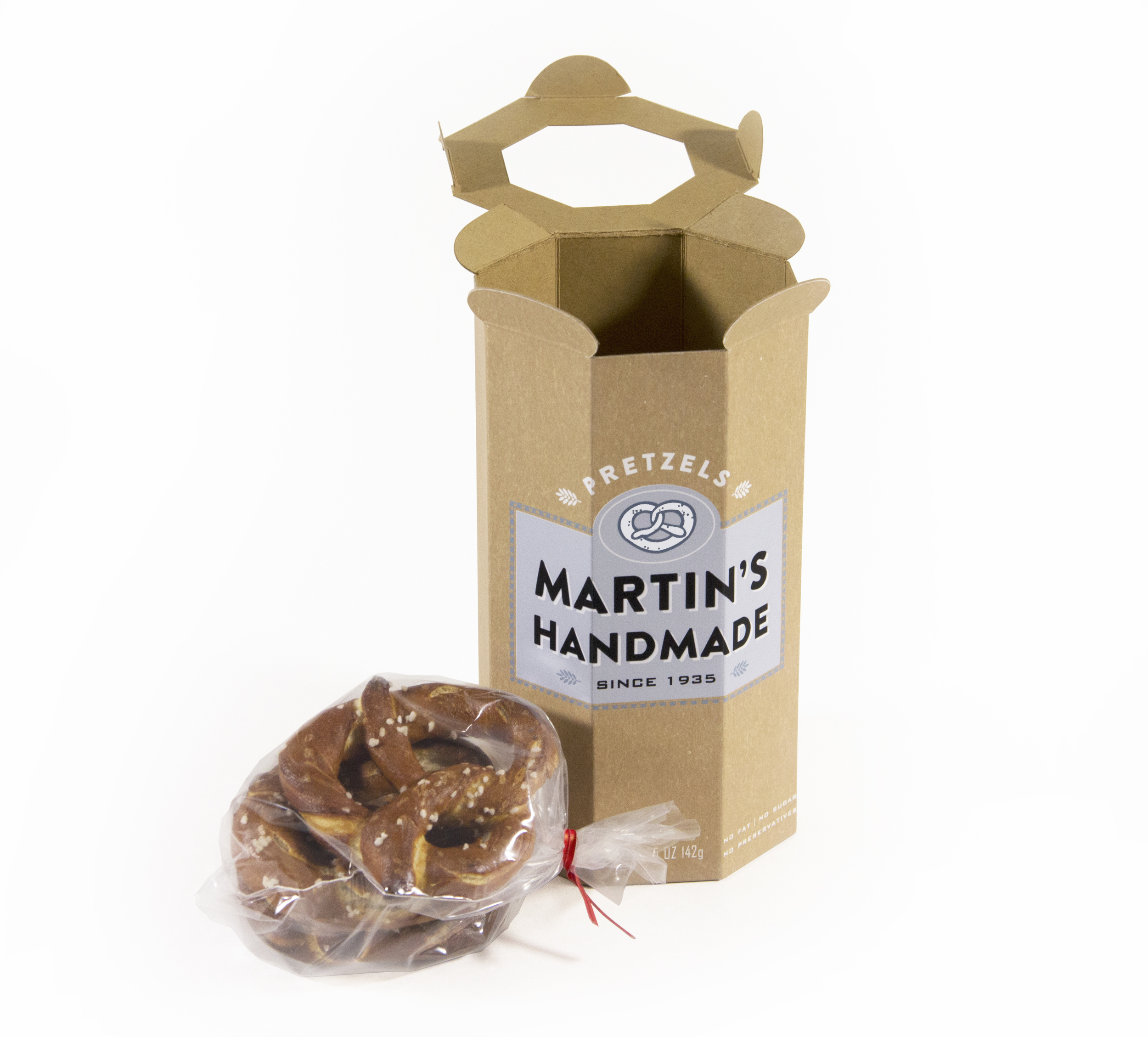
Packaging was designed to stand out through the use of a totally unique octagonal form, the use of un-treated card stock, and the simple but powerful presentation of the evolved brand which food lovers have known and respected for years. The heritage of the Martin's name carried serious weight but this is not a purely retrospective brand, our goal was to help elevate the Martin's name above that of hipster upstarts and to progressively build upon the timeless quality of this eighty year wholesome treat. The redesign gives Martin's a simple clear voice and identity with plenty of scope for future expansion and new adventures.
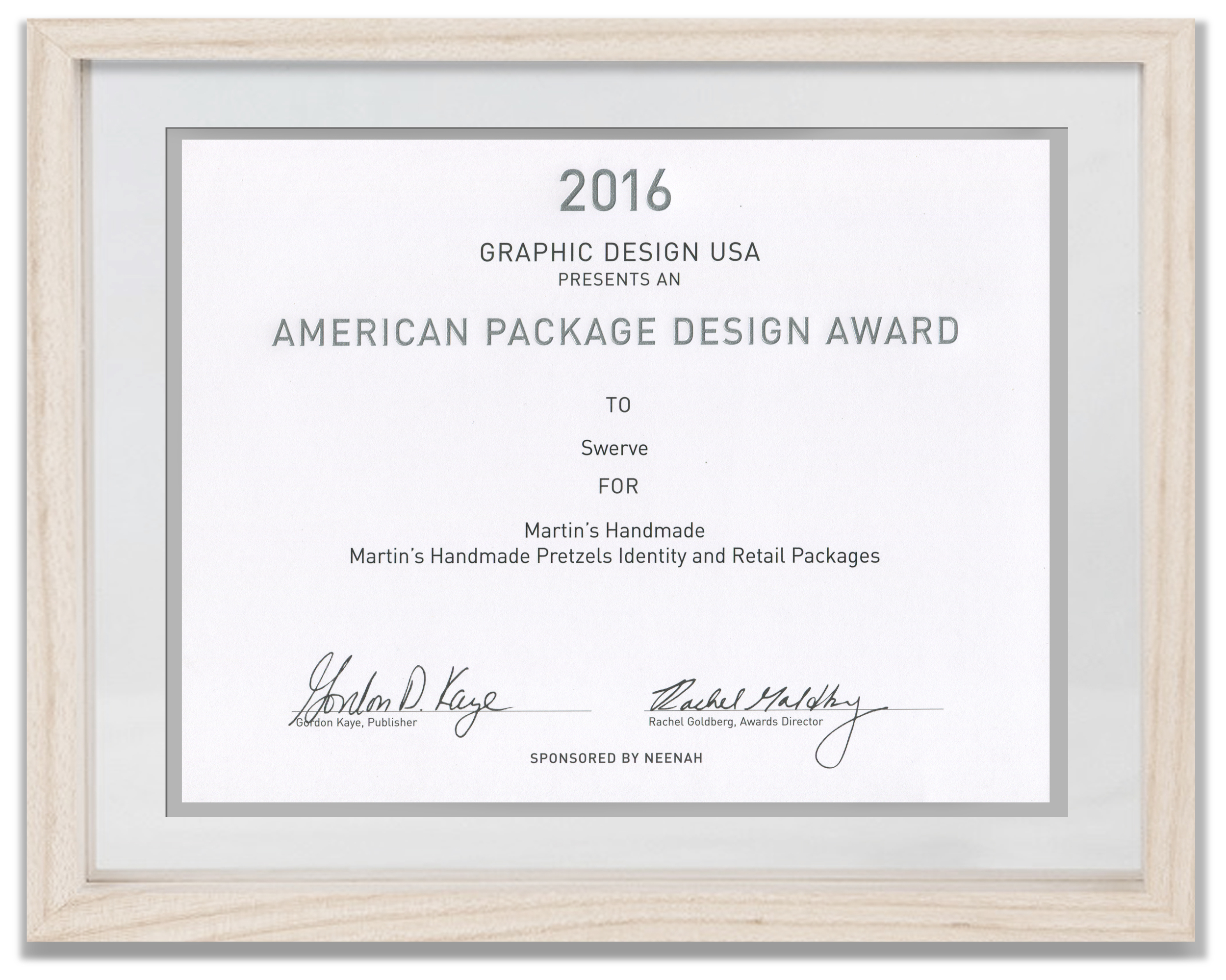
Winner of Graphic Design USA 2016 packaging award

